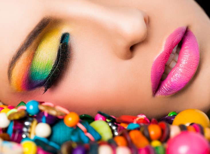
Creating a colorful makeup look is something that’s difficult to master. If you put the wrong colors together, you’ll end up with a muddied mess instead of an eye-catching design. How do the pros create such remarkable styles?
The answer is by utilizing the color wheel to its greatest extent. Follow these tips and you’ll be ready in no time!
Learning the Language
The first thing to do when you start learning about color theory is to learn what different color words mean.
Primary colors
Primary colors are the colors red, yellow, and blue. These colors make up all the other colors of the rainbow.
Secondary colors
When you mix equal parts of two primary colors together, you get a secondary color. Red and yellow makes orange; yellow and blue makes green; and red and blue makes purple.
Tertiary colors
If you add a little bit more of one primary color than the other, you’ll end up with a tertiary color. For example, if you mix more blue than red, you’ll get a blue violet.
Tint and shade
Instead of just mixing colors, you can also mix a color with black or white. Mixing a color with white creates a tint. If you add white to purple, for example, you’ll create lavender. The opposite, meaning mixing a color with black, creates a shade, which will make a color deeper and richer.
Finding a color wheel
The whole point of using color theory for makeup is that you’ll be utilizing a color wheel!
A good color wheel doesn’t have to be complicated. The most basic color wheel, with the primary colors, secondary colors, and six tertiary colors, is just fine. You just need a basic visual representation.
Putting Colors Together
Once you know how the language of colors works, it’s time to start putting them together for a bright look. Grab yourself a color wheel and start visualizing color combinations.
Complementary colors
Complementary colors are those on opposite sides of the color wheel. Yellow and purple, for example, are complementary colors.
The name might be a little misleading, however. Unless you have a very deft hand, using complementary colors together in the same look can end up looking garish and confused.
Complementary colors are great for making an eye-catching look if used opposite each other, however. An orange eye shadow with a blue lipstick will certainly stand out, and if you match the tints or shades, they’ll become truly complementary.
Analogous colors
Whereas complementary colors are opposite each other, analogous colors are right next to each other. Blue and blue violet are analogous colors.
Analogous colors are often used to create palettes because they go together very well. If you want a cohesive makeup look, you’ll usually want to stick with colors that are only a few steps apart from each other on the color wheel.
A good way to add depth to a look created with analogous colors is to play around with tint and shade. A dark red with a light red-violet creates contrast without clashing.
Creating the Look

Now that you know a little bit about color theory, it’s all up to you when it comes to the actual design! You could go bold with complementary colors for your eyeshadow and lipstick; or, play it a little safer with exclusively analogous colors. It’s all up to you.
If you want to get someone to help you with your look, you can find an Ogle School salon near you, where you can get expert input on a brand new color match!
However, if all this talk of color theory has really opened your eyes to how much you love creating makeup looks, you might even want to get involved in a cosmetology career. Check out the Ogle School cosmetology program to see if it’s the right fit for you.


